Next-Generation Data Platform for Financial Modeling
Role
UX researcher and Ui designer
Industry
Fintech
Duration
48 HRS

Overview
This project was part of a 48-hour design challenge for a DE Shaw interview, where I was briefed on a problem and tasked with translating my thinking into high-fidelity screens — prioritizing design thinking over perfection.
The brief centered around DE Shaw's investment teams, who work with complex financial models spread across tools like Excel, Python notebooks, and proprietary scripts — with no unified space for collaboration or exploration. The brief proposed a desktop-first Data Platform that bridges the gap between quant analysts and non-technical decision makers, supporting both visual drag-and-drop modeling and advanced scripting, with integrated dashboards, data connectivity, and permission-controlled collaboration.
Problem Statement
Financial models today are fragmented across Excel, Python, and internal tools → hard to maintain consistency.
Non-technical decision makers (portfolio managers, risk managers) struggle to interact with highly technical models.
Collaboration challenges: no single source of truth, version conflicts, and data silos.
Time wasted on data gathering and cleaning before actual modeling begins.
Limited ability to visualize model structures and create interactive dashboards for quick insights.
Project Objectives
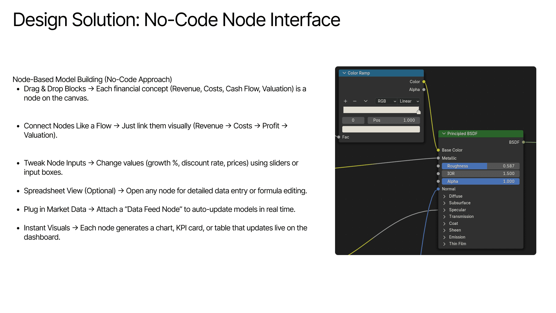
To suggest a unified modeling interface that seamlessly blends visual drag-and-drop with code-based workflows, backed by prebuilt templates for valuation and risk analysis.
Integrate real-time data from internal and external financial sources, while enabling version control, team permissions, and collaborative sharing. Support interactive dashboards and reporting to drive informed, agile decision-making.
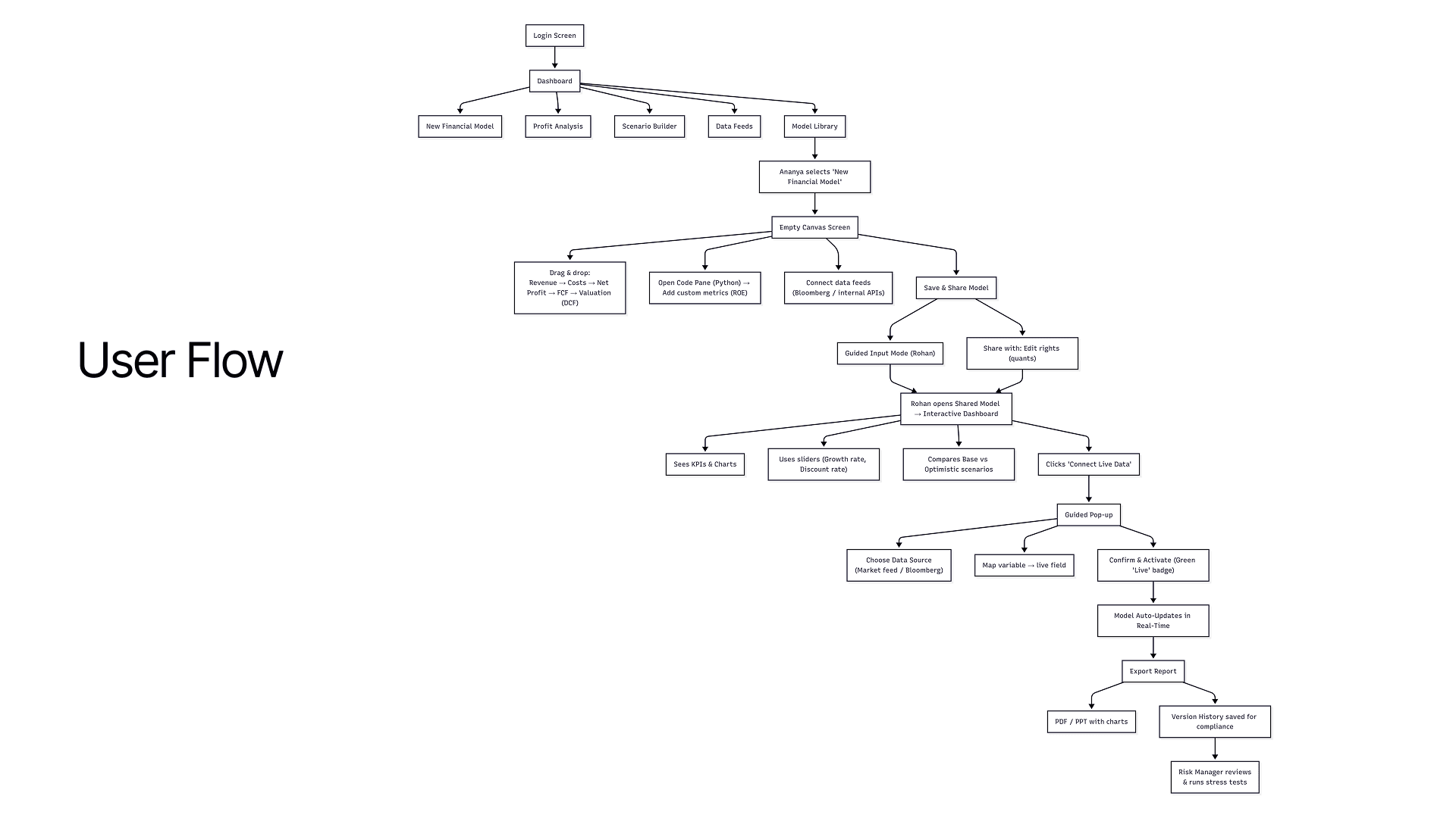
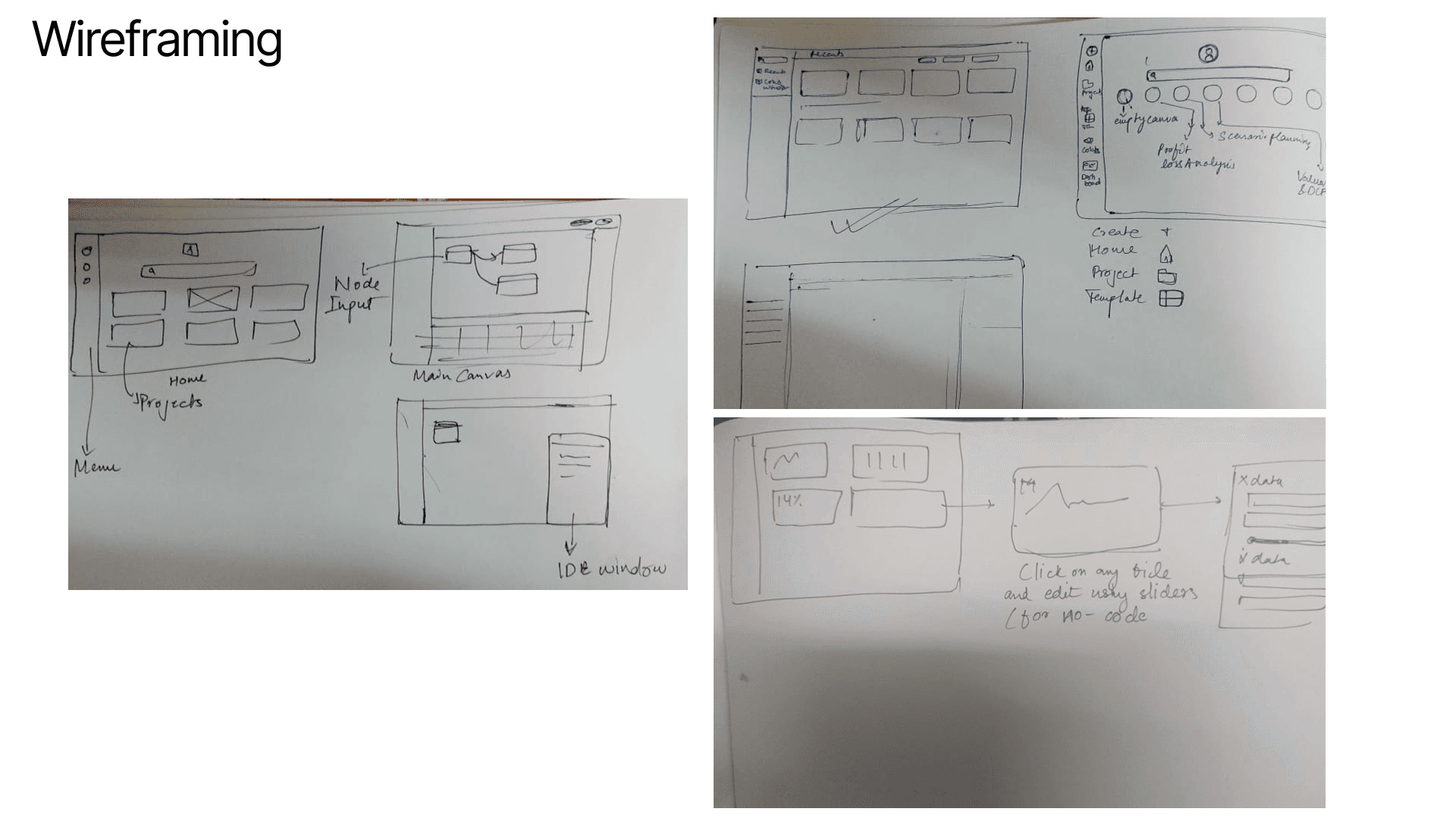
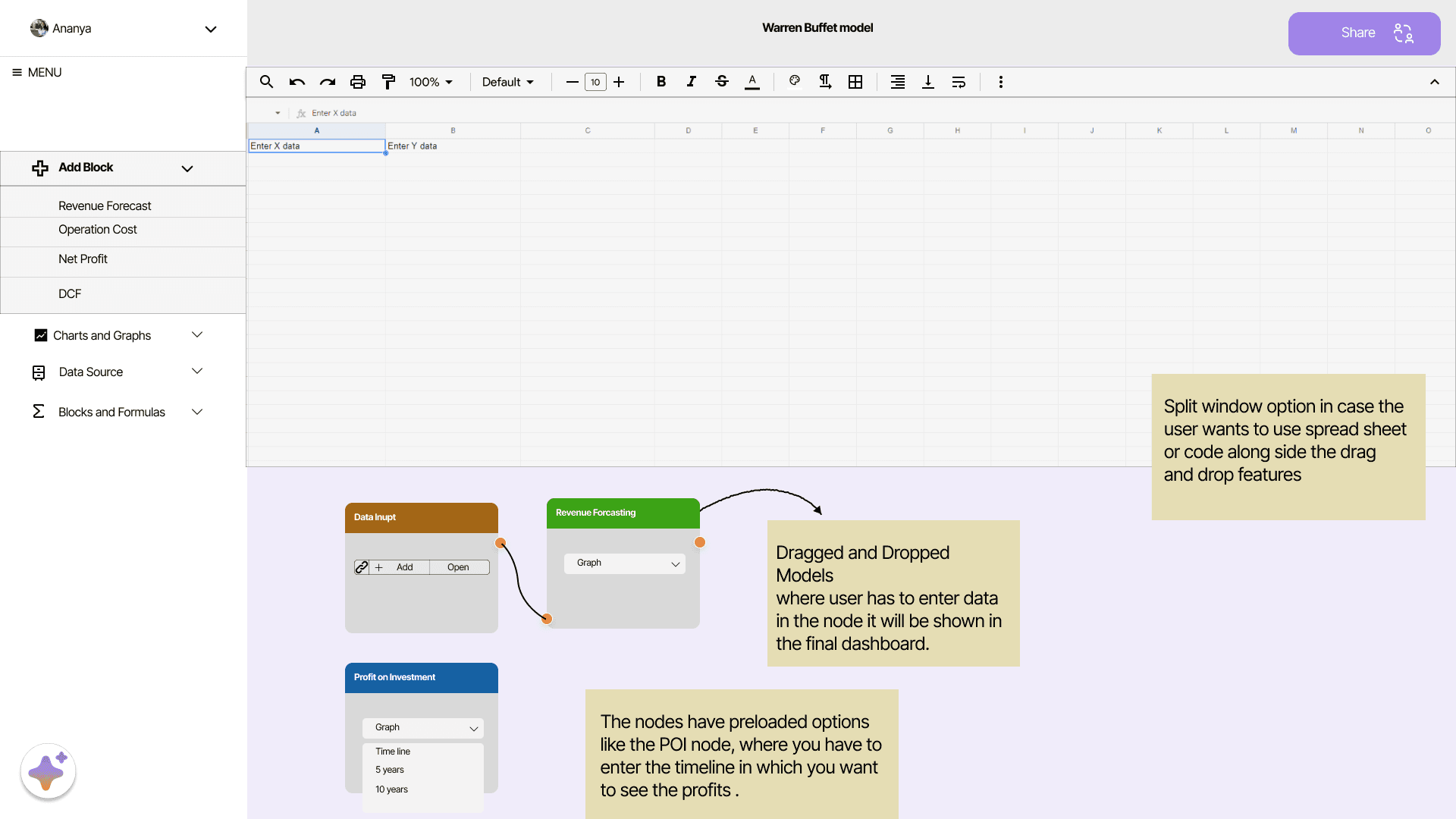
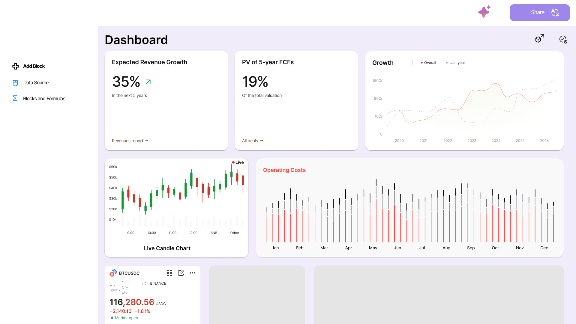
Final Screens
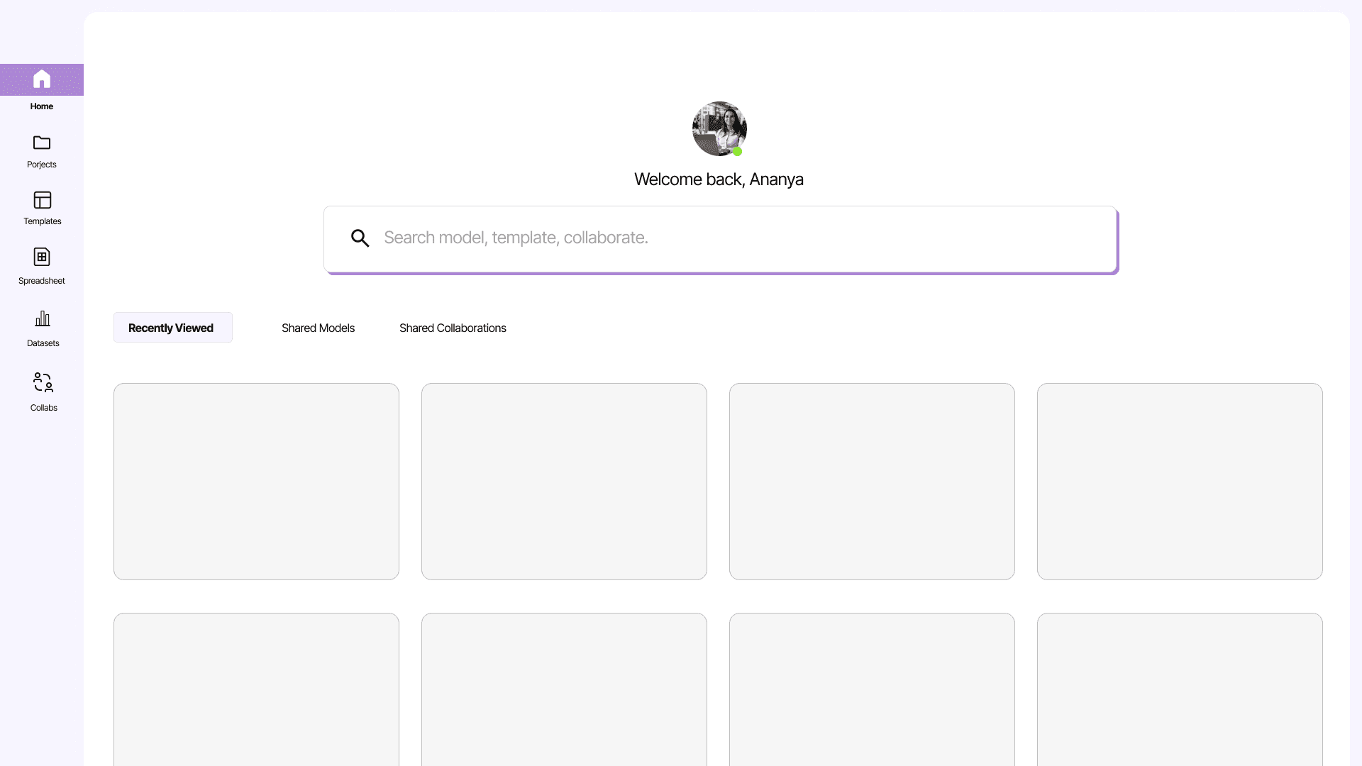
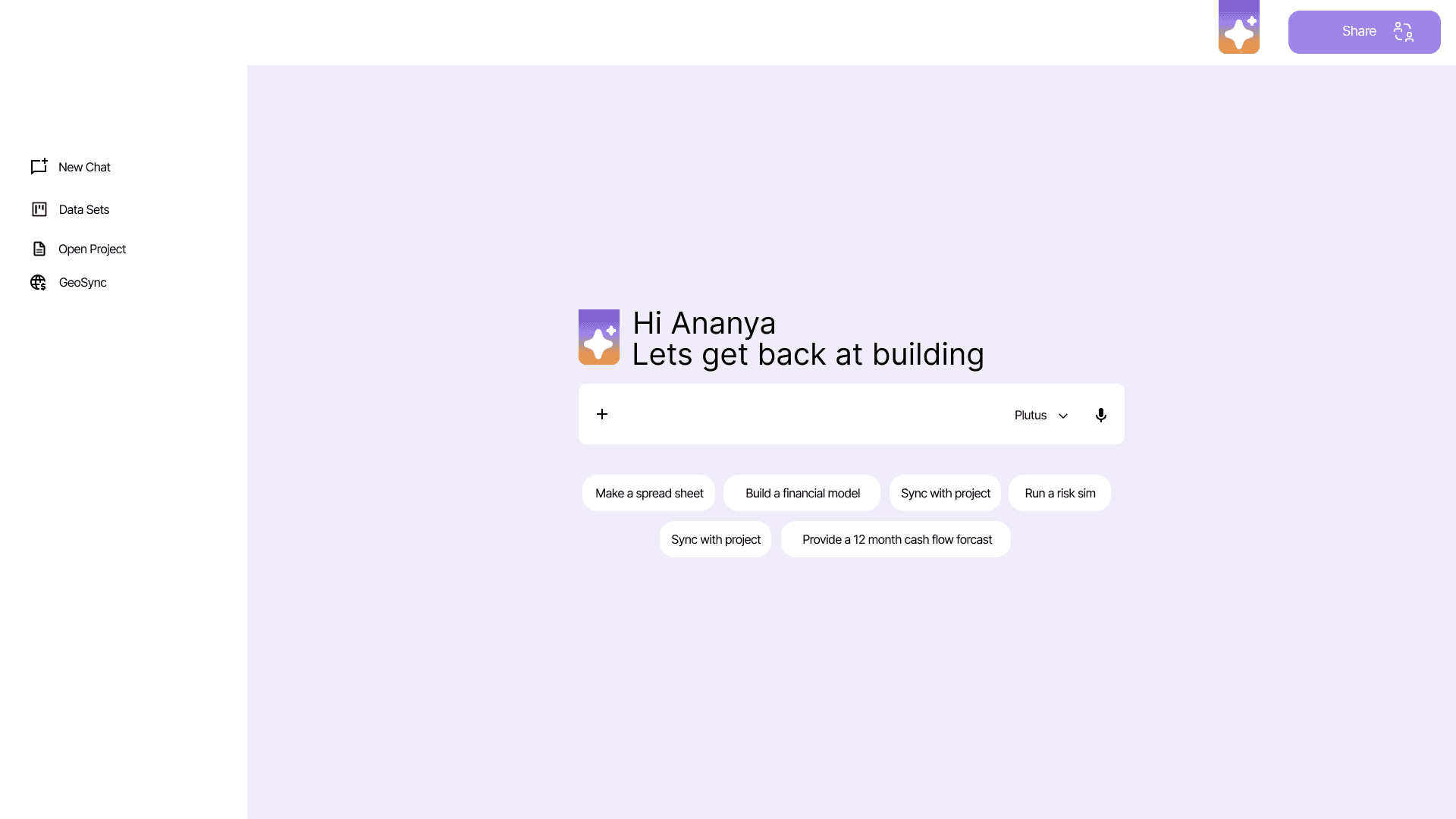
Home Page
Template Input Using Nodes in real time
Dragged and Dropped Models where user has to enter data in the node it will be shown in the final dashboard.
The nodes have preloaded options like the POI node, where you have to enter the timeline in which you want to see the profits .
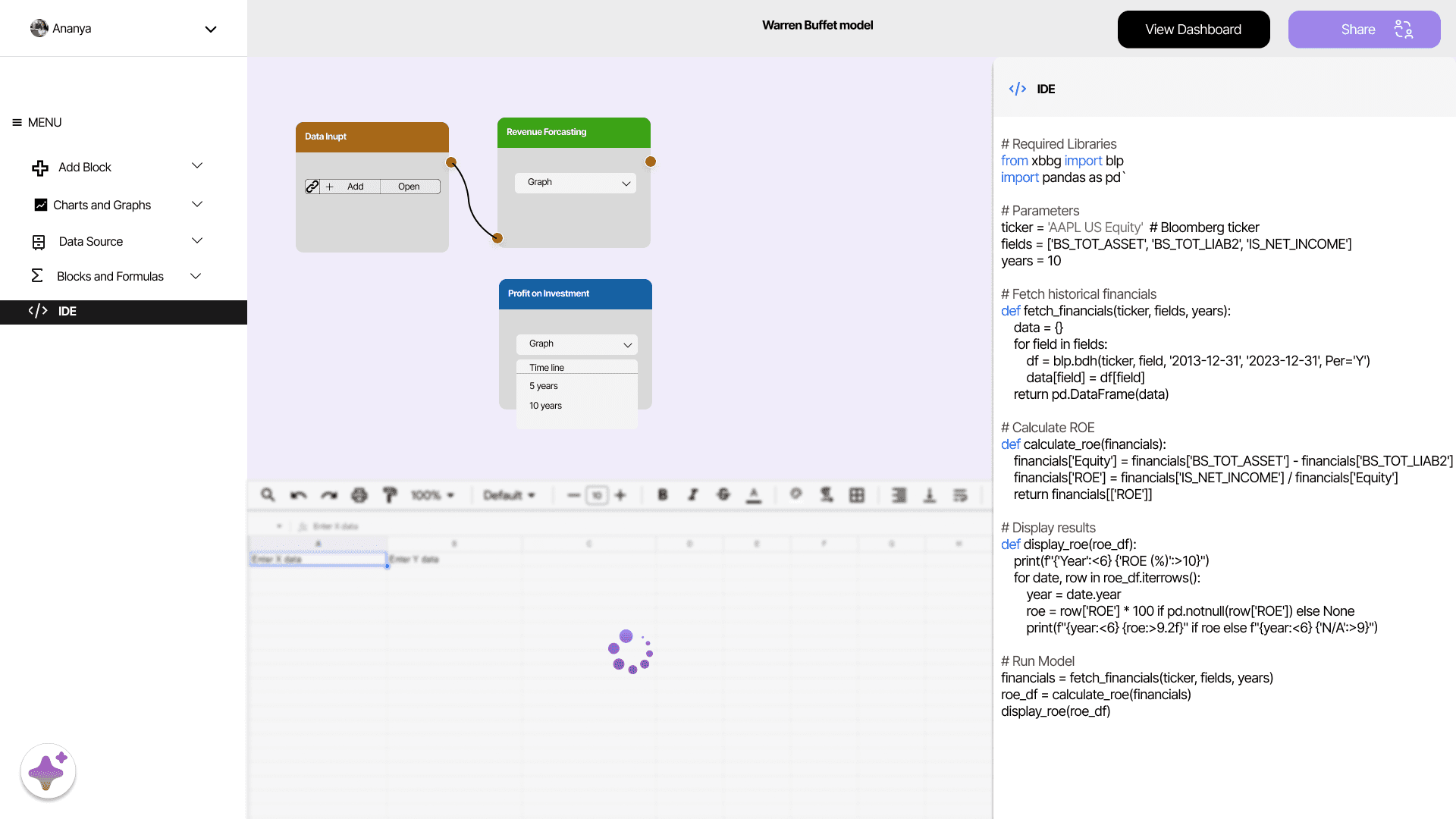
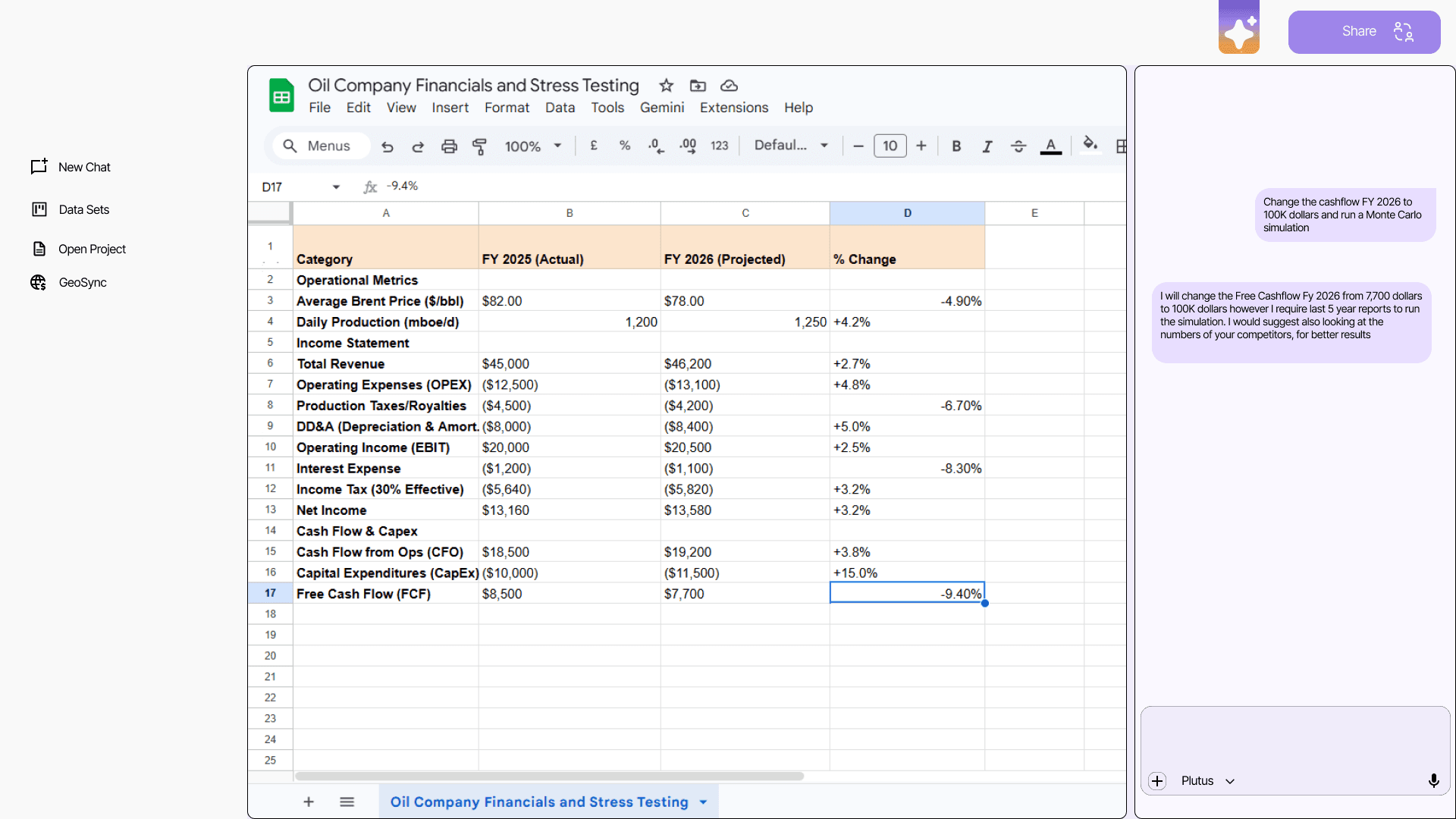
Frame showing live editing
As the analyst codes, the spreadsheet updates in real time as the user runs a code. it can be later saved and converted into a usable model
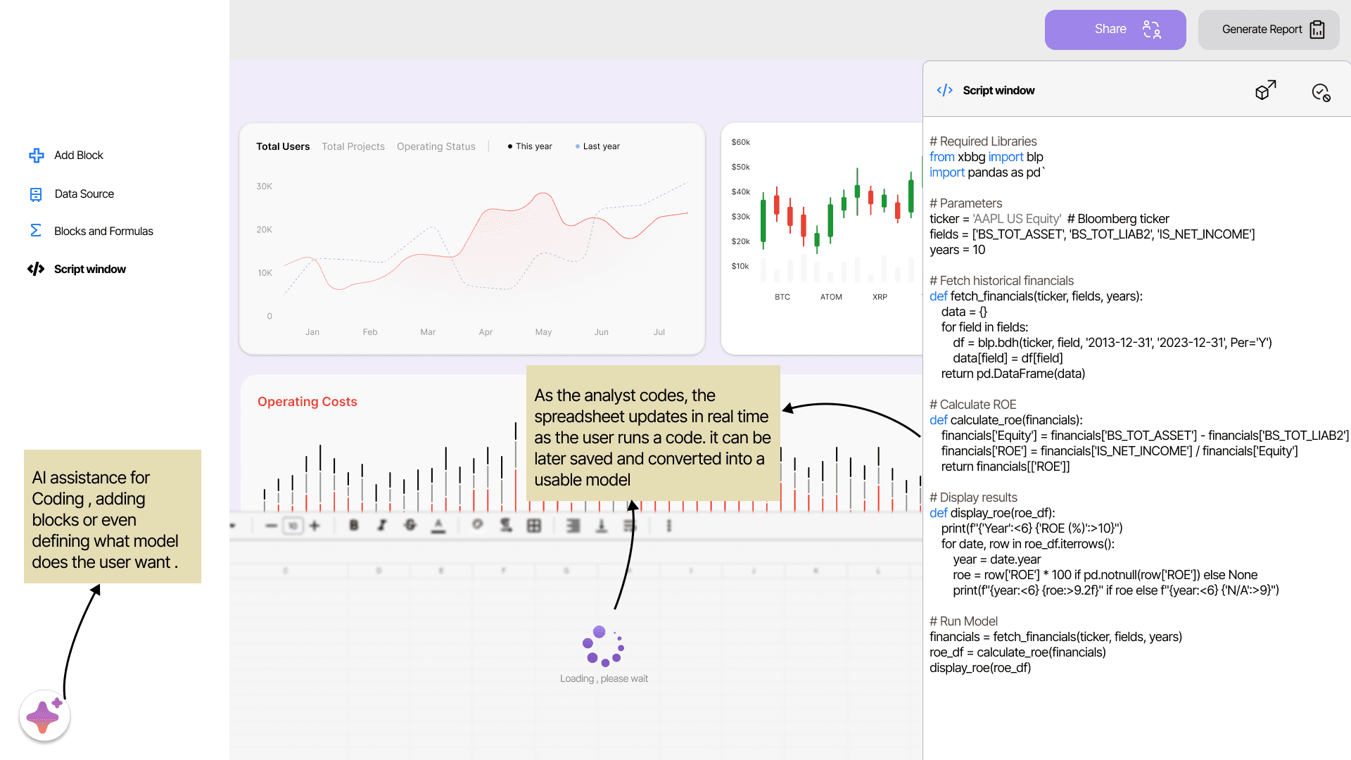
AI Tool Integration
An AI-powered core that handles the heavy lifting — so users can focus on decisions, not complexity. Whether you're a quant analyst building intricate models or a portfolio manager trying to make sense of a report, the platform adapts to your expertise. From generating financial models and templates to interpreting data and running simulations, it makes sophisticated financial workflows accessible to everyone.
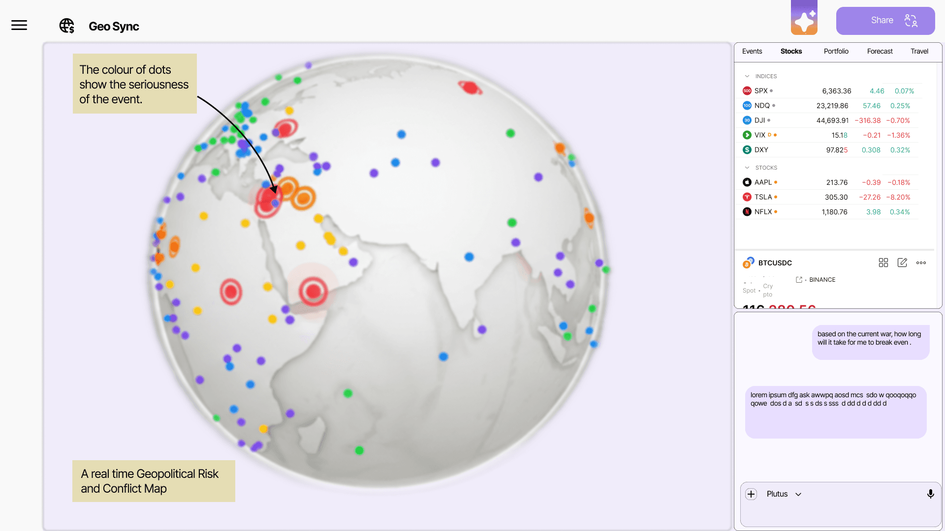
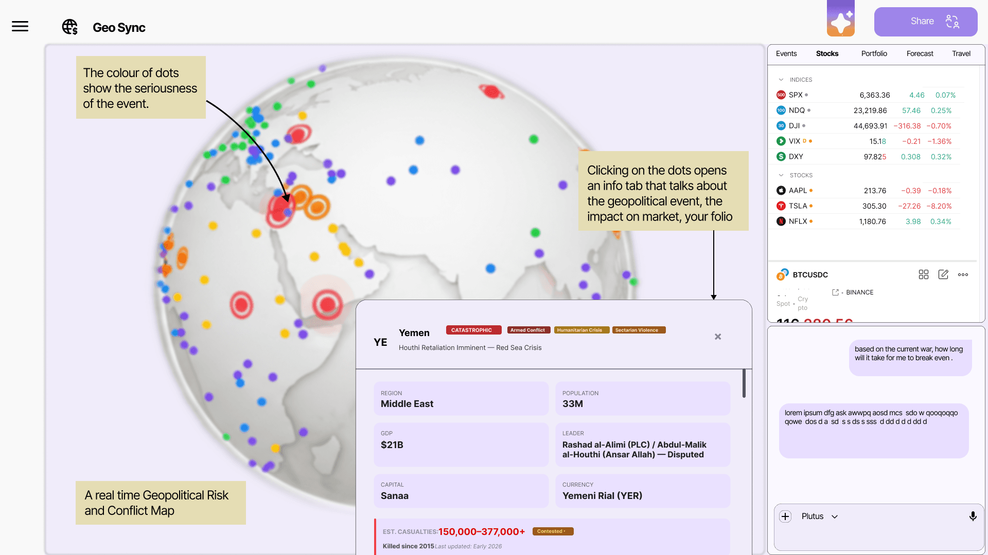
Introducing GeoSync.
GeoSync is a real-time geopolitical risk map that tracks global events and surfaces the ones that matter to your portfolio. Color-coded dots plotted across an interactive world map indicate event severity — clicking any marker opens a detailed side panel breaking down the conflict, its macroeconomic context, and the direct impact on your holdings.
Paired with a live stock ticker and an AI assistant on the right, GeoSync doesn't just inform — it acts. From Red Sea shipping disruptions to political instability in emerging markets, it flags risks, suggests protective strategies, and surfaces opportunities before the market moves.
My takeaway
This project reshaped how I think about design in high-stakes environments. Diving into the intersection of geopolitics and financial markets made me realize how instantly global events can ripple through a portfolio — and how critical it is to surface that information in real time. More importantly, it reinforced that even in a field as technical and fast-paced as quantitative finance, thoughtful UI/UX isn't a luxury — it's what makes powerful tools actually usable, for both the expert and the decision maker in the room.
Other projects

Design project : Hyreblok. Reshaping the hyring process.
Elevating the user experience for job seekers and recruiters.

Empowering Communication
UI/UX Case Study for Assistive eyewear for Deaf and Mute

Brand Identity Design for a dry fruits brand.

STEM_LOOPER
A music sample mix matching platform for everyone.